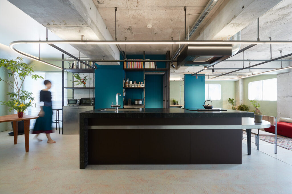
Project Type: Renovation / Site: Tokyo Setagaya / Floor area :90㎡ / Design :HAMS and, Studio / Build: Roovice / Iron crafts : Kozuka manufacturer / Plants : GREENIAN
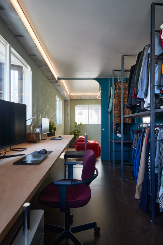
This is a renovation project of an architect’s own residence. The 90 ㎡ floor on the second floor of the apartment building in a high-density residential area was planned as a base for the diverse activities of the architect: a residence, an office, a studio, and a showroom.
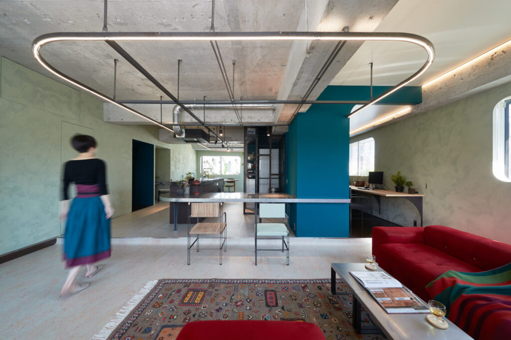
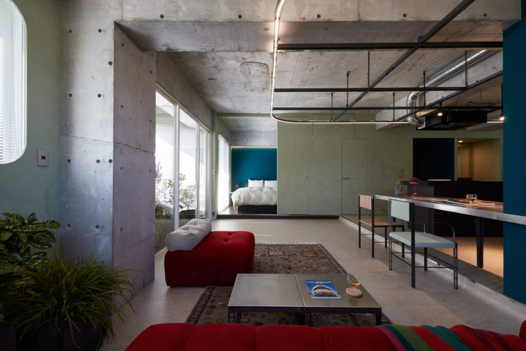
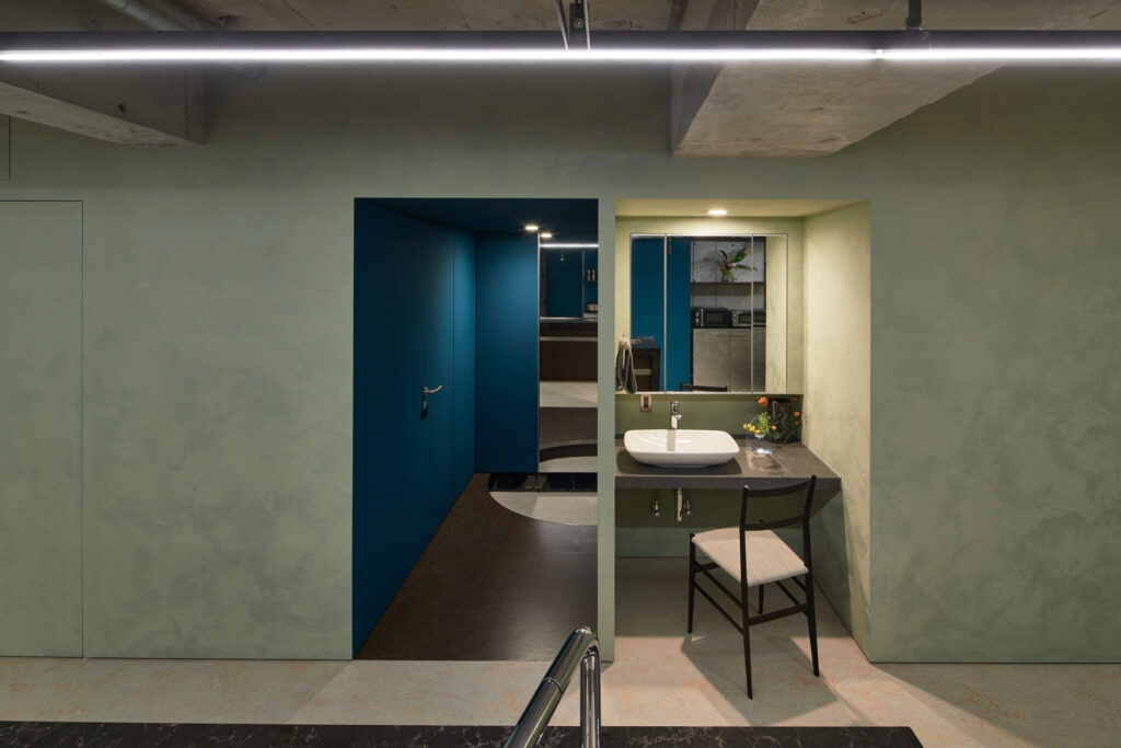
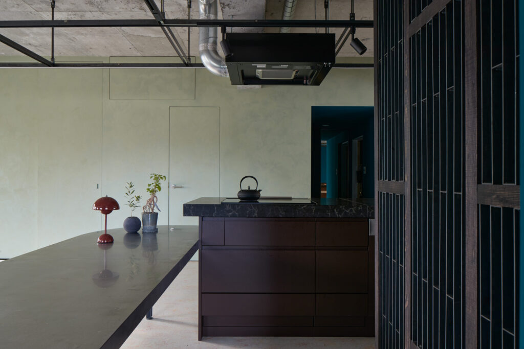
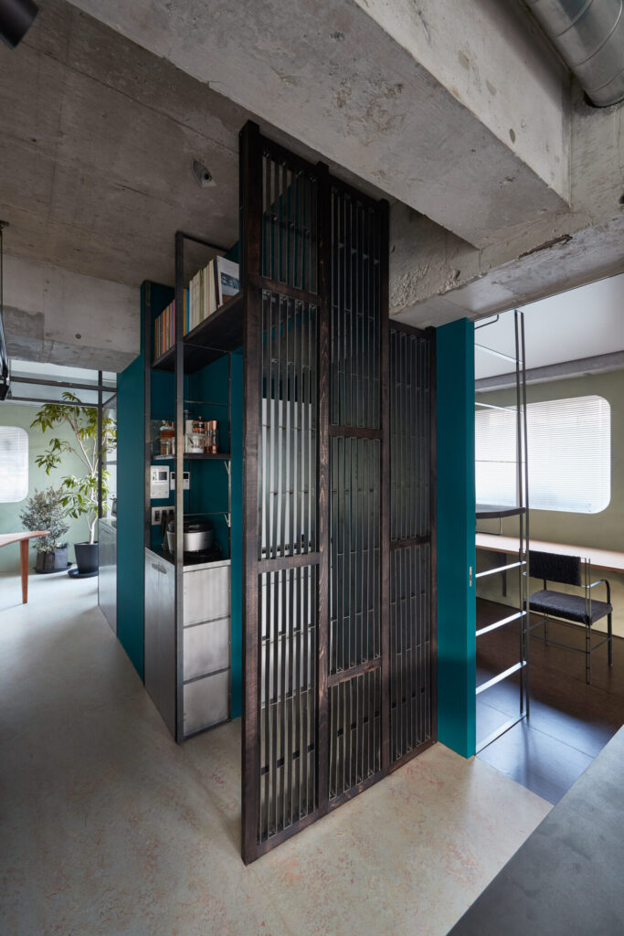
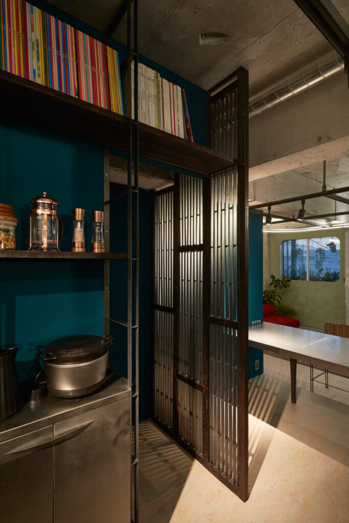
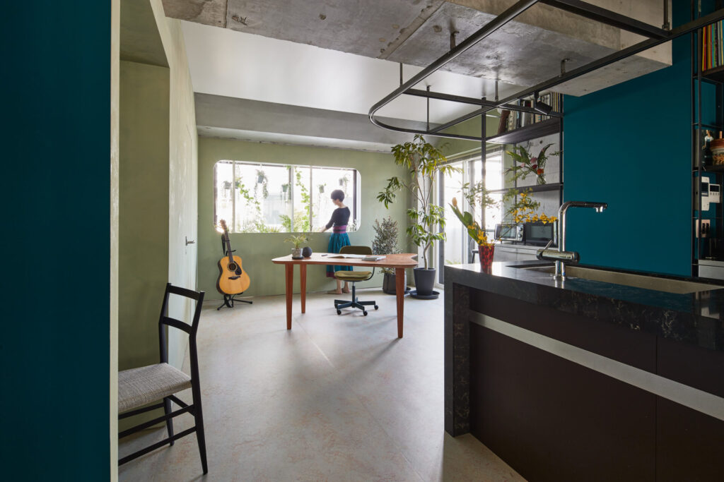
We carefully read the existing conditions and proceeded with the renovation plan, respecting “a bright space with eight openings” and “the materiality of the aged concrete”. In order to utilise the eight openings, after the large number of design study to maxmise air volume and line of sight, a one-room was adopted merging of dining and living room and kitchin and atelier that can be partitioned by sliding doors. Furthermore, in order to maximize the presence of the existing concrete structure, steel flat bars were inserted to create a contrasting relationship between the materials and structural members.
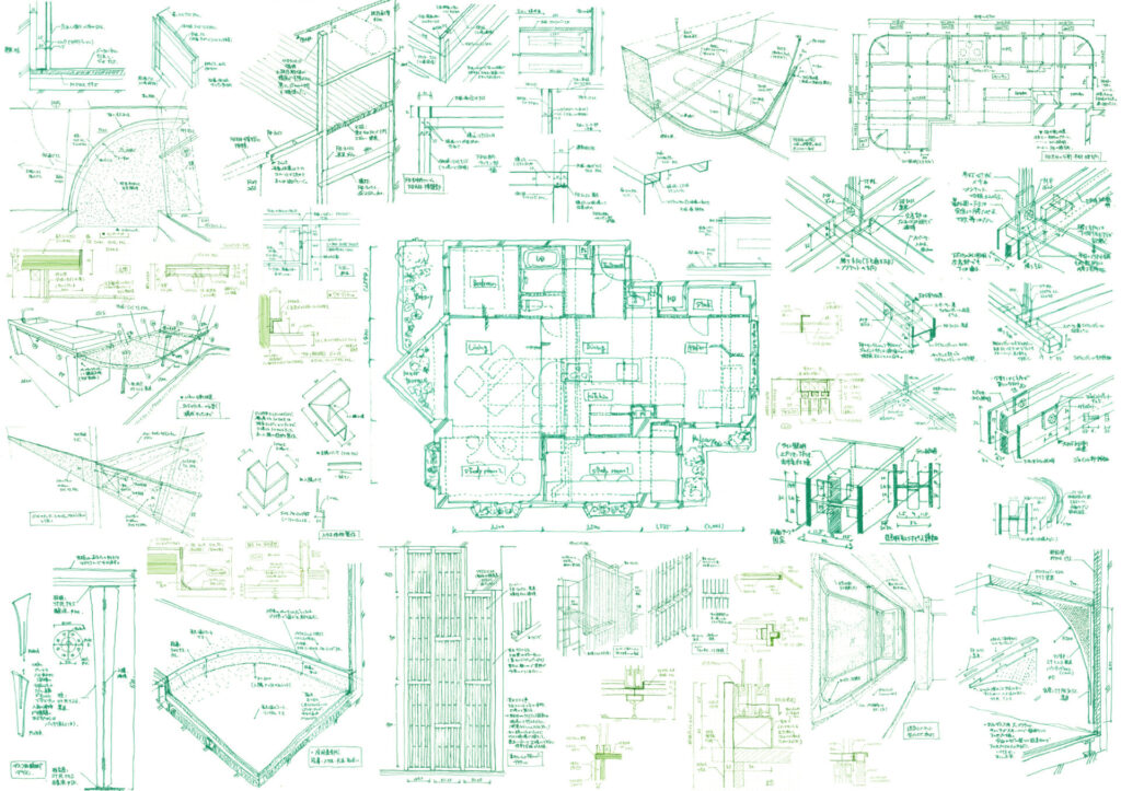
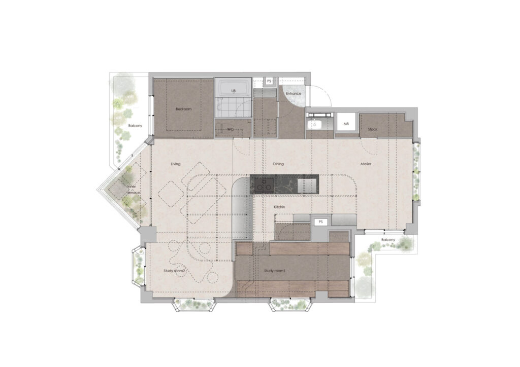
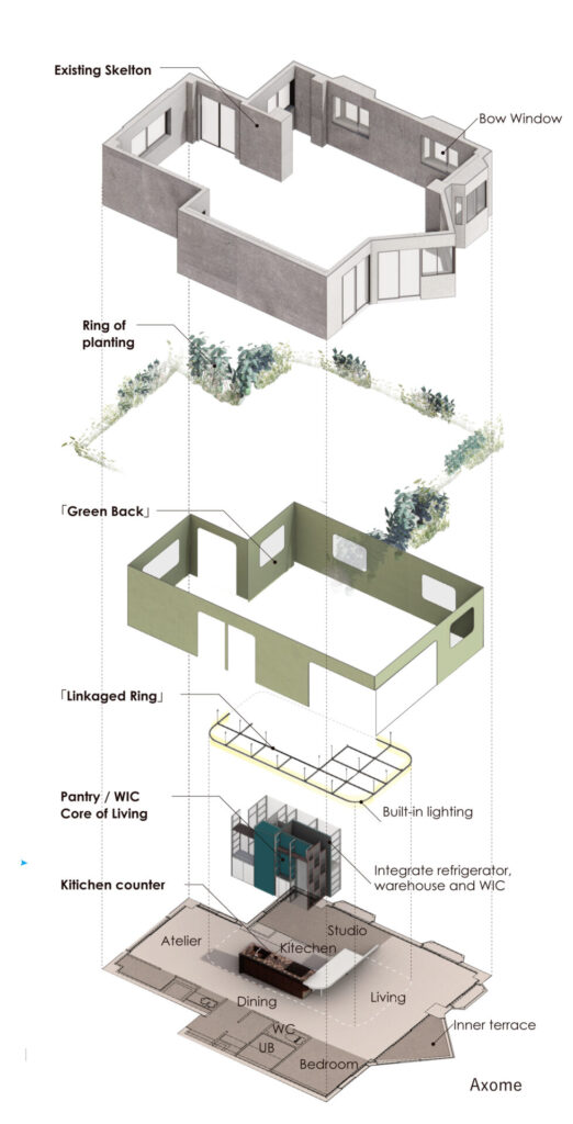
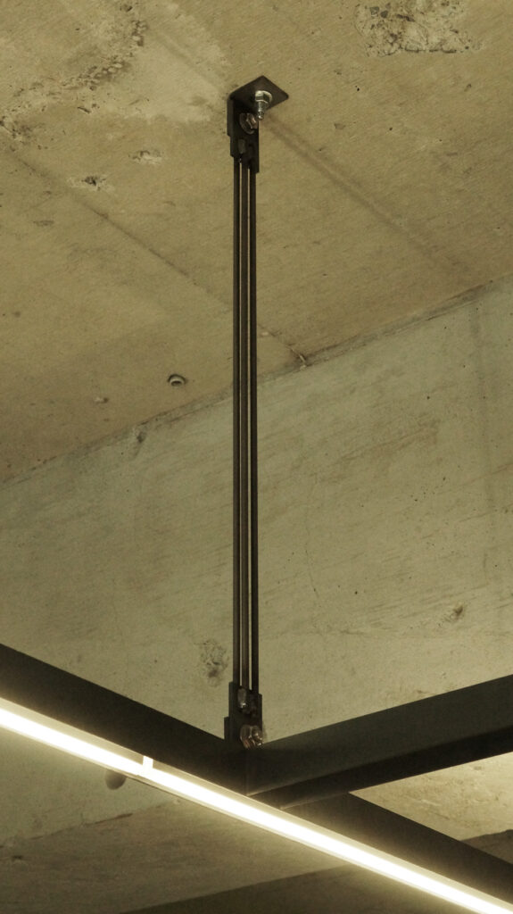
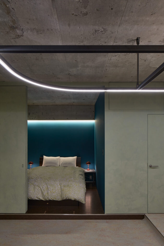
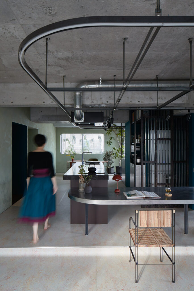
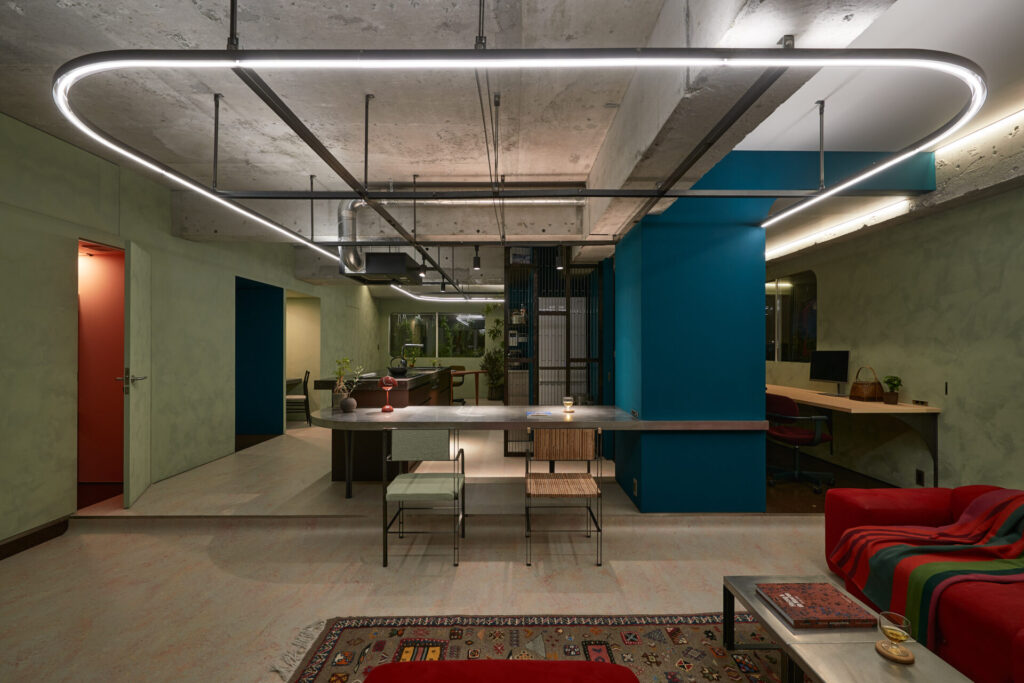
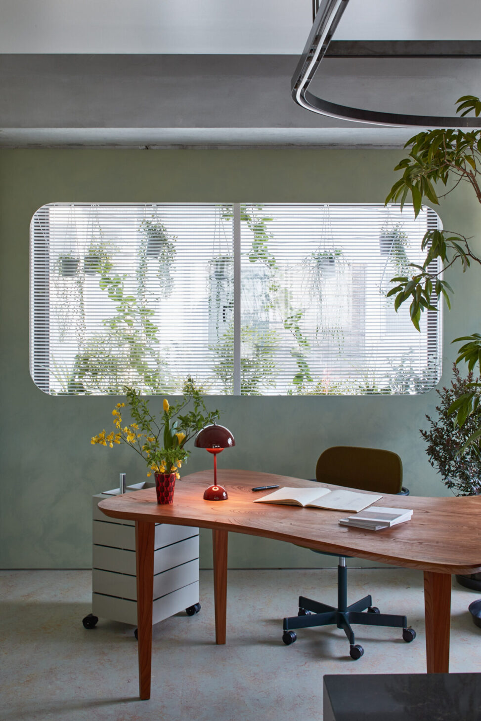
A ” Linkaged Ring” was planned in the center of the plan as a hardware suspended from the existing ceiling, crossing the kitchen, dining room, living room, and studio, which are all arranged in one-room. It is composed of two flat bars, with lighting fixtures placed above and below. When used as a studio, it can be utilized as a lighting baton. The design contrasts the irregular and strong existing frame with the sharp straight lines of the steel frame passing through FL+2050, and the integrated lighting brings them both to attention.
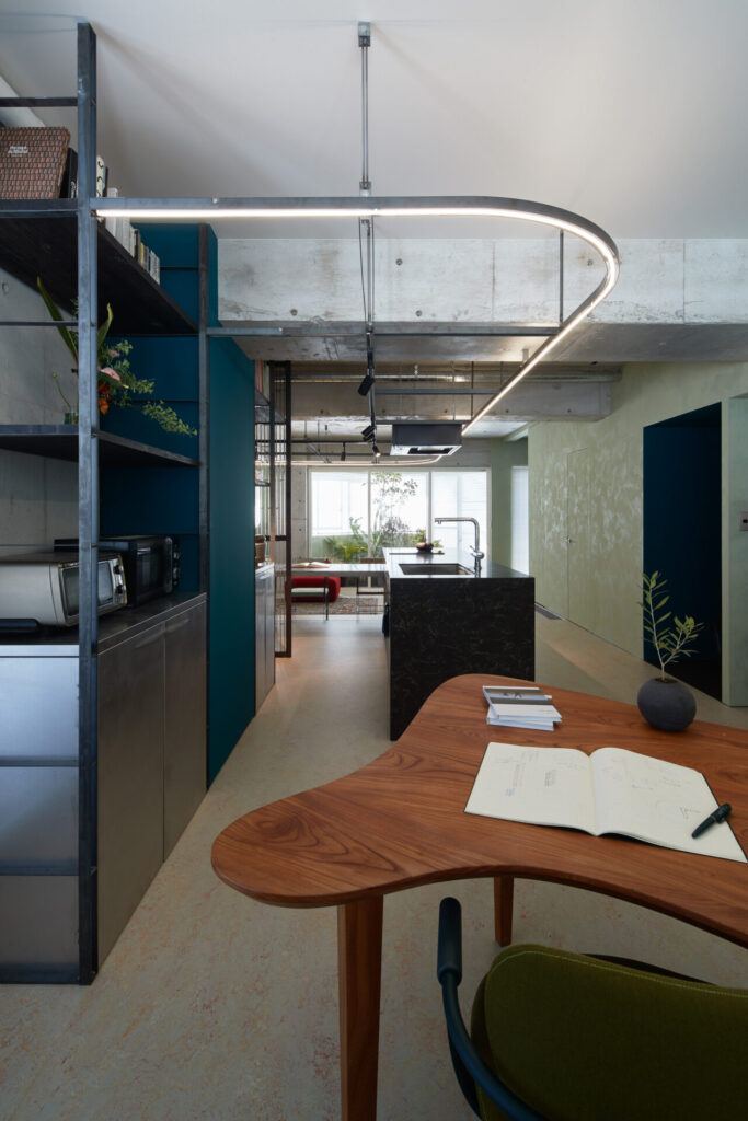
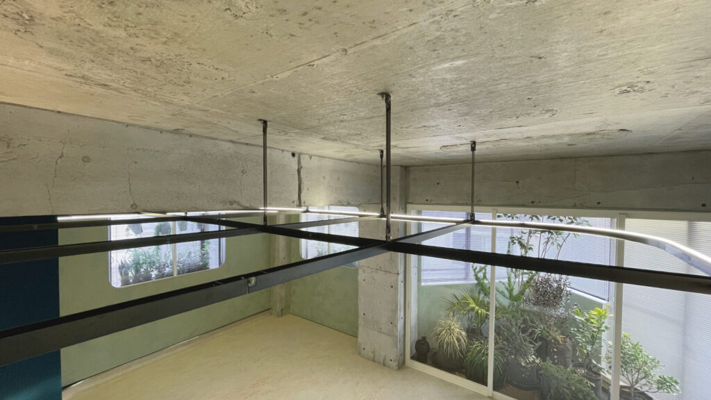
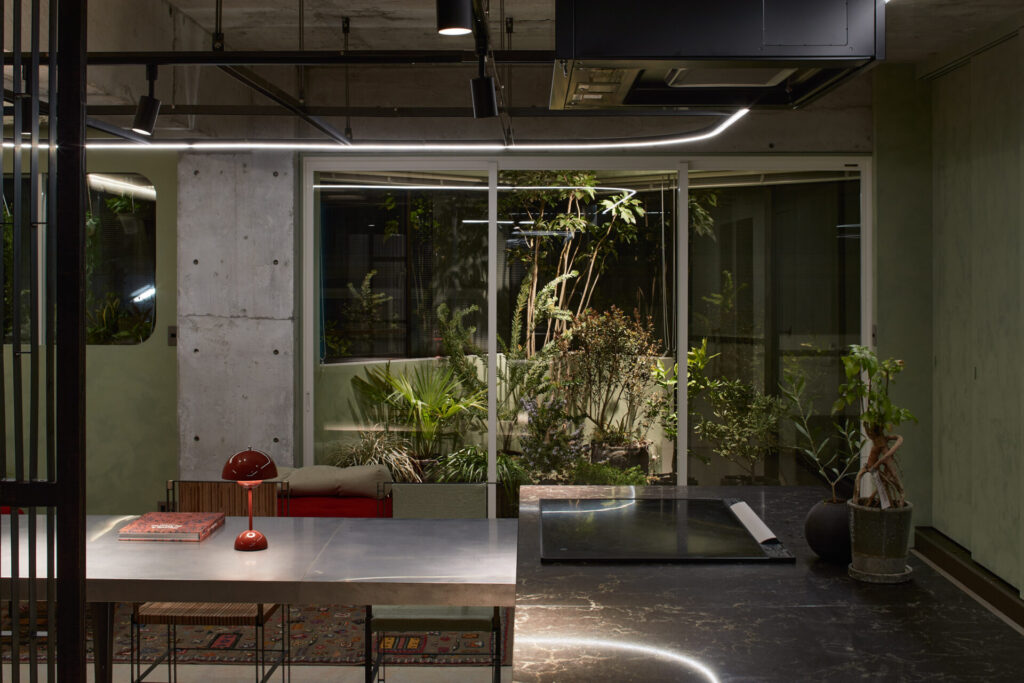
The distance from the neighborhood is an extremely important theme when living in the high-density residential area of Tokyo. We planned a “Green Back” as a background surrounding the one-room.

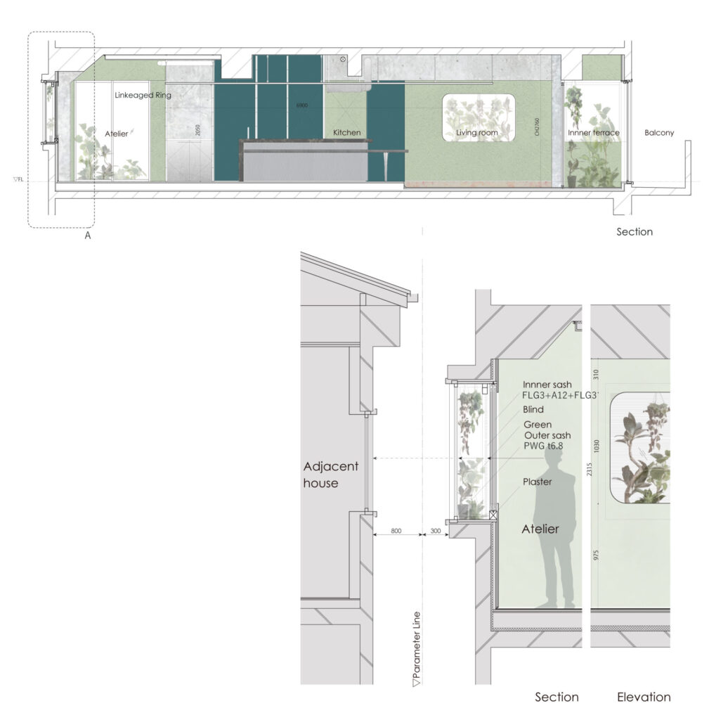
Using the existing bow window, the green layer made by plants was put together, partitioned by an inner sash. the sash was hidden by covering the inner wall from the inside, and it was set up as an opening with rounded corners. The four layers avoid direct line of sight with the neighbors, while controlling direct light and improving thermal insulation. The building is designed to be a comfortable and attractive space at the same time. The idea was to create a perimeter that is derived from the central Linkaged Ring, and which can be continuously experienced as a single enclosure up to the exterior walls of the neighborhood filtered by the Green Back.
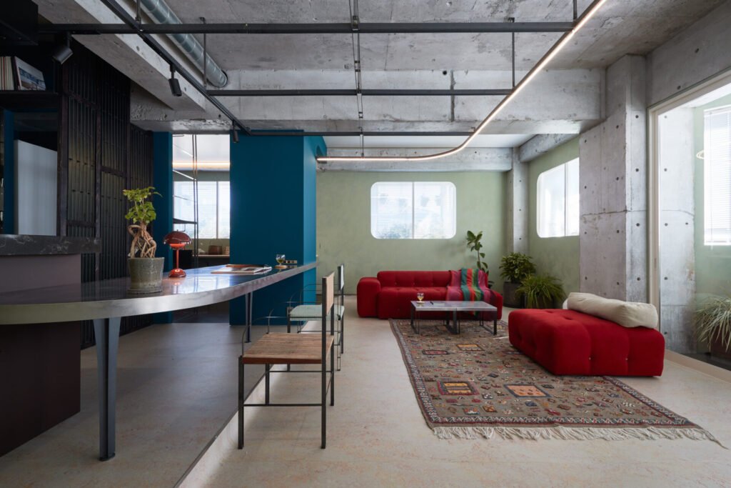
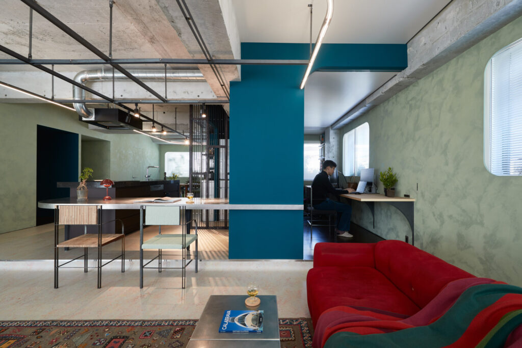
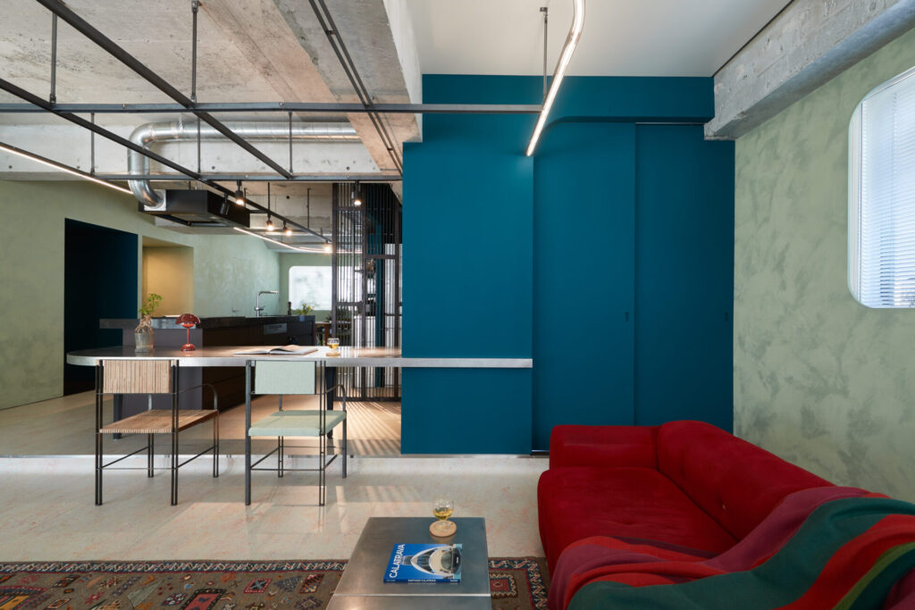
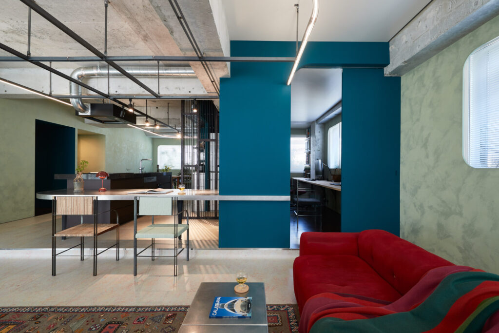
In creating a multi-use space, it was important to thoroughly eliminate “residentialness” in the interior. The one-room that reads and maximizes the existing will become a vessel for various activities that overlap work and private life, and will also change in the future as the life stage of couple changes. In today’s world where lifestyles are diversifying at high speed, architects themselves want to stay at the forefront of practice together with their own houses.

コメントを残す